Gallery
Examples
Once your data is in Graphite, there is a wide variety of ways you can combine it to get interesting charts. Here are just a few examples of the ways you can present the data collected from g2g.
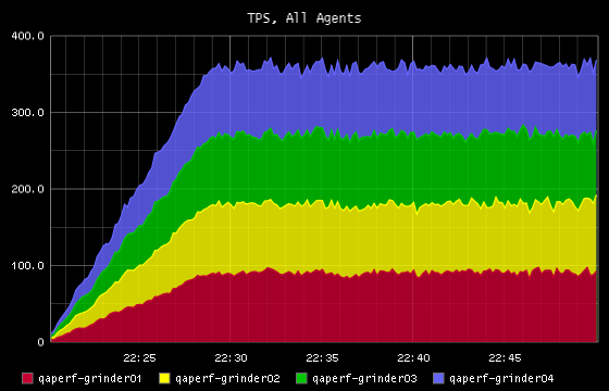
TPS for All Agents
A stacked graph showing the total TPS achieved by each running agent process, as well as the total for all agents.
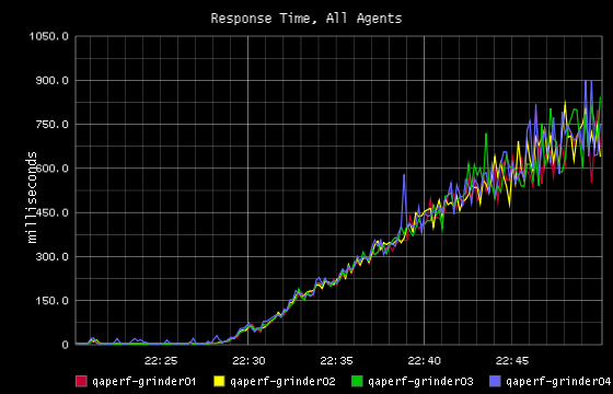
Response Times
When the response times for all agents are overlayed, we can get a sense if the agents are getting results that are consistent with each other.
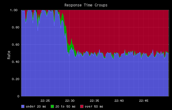
Response Time Groups
Shows the percentage of all requests that happen in user-defined response time thresholds.
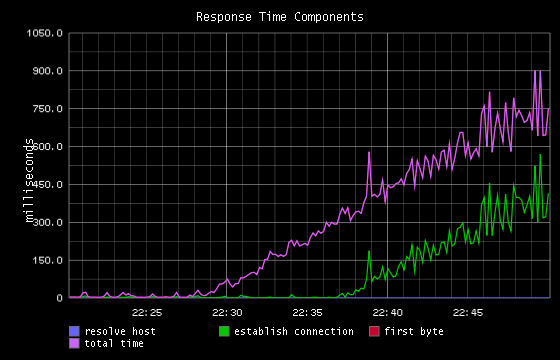
Response Time Components
In this graph we take advantage of the fact that Grinder shows us not just the total response time, but also the separate components of response time, including
- host resolution
- connection establishment
- time to first byte
In this test, the “total” and “first byte” times were close enough together that the “total” line is obscures the “first byte” line.
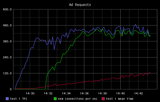
New Connections and Total TPS
In this test we discovered that as load increased, a jump in new connections would occur.